 Clear Cortex
UGC examples: the ad formats that work, and how each one is built
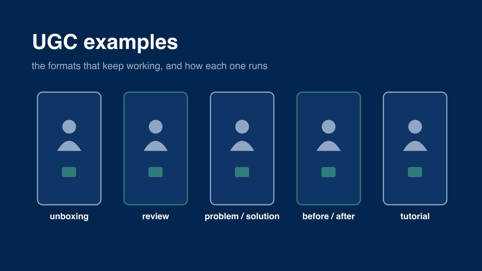
most UGC that works fits one of a few formats. the person, the product and the setting change, but the structure underneath stays much the same, and that structure is the useful thing to copy, not one brand's video.
so instead of a gallery of other companies' ads, this guide describes each format: how it runs second by second, why it works, and where it goes wrong. if you are new to the term, start with what is UGC.
what every good example has in common
a media buyer who makes these for skincare stores summed up the pattern in one line:
"For physical products the winning pattern is UGC: a real-person hook in the first 2s, the product solving one specific problem, captions on, shot vertical."
that holds for every format below. one person, one problem, a reason to keep watching in the first two seconds, captions for people watching on mute, and a 9:16 frame. the same buyer explains why the polished alternative loses:
"Studio pack shots underperform because they read as an ad instantly and people scroll."
1. unboxing
structure. the parcel arrives or is already on the table (0–2s) → it is opened on camera, with a reaction to the packaging (2–8s) → the product is handled, turned over, shown at real size (8–20s) → a first impression and who it is for (20–30s).
why it works. it copies the moment the viewer will have after buying. people get to see real size, finish and packaging before paying, which matters most for gifts, beauty, gadgets and anything with a premium box.
where it goes wrong. unboxing a product that looks ordinary out of the box. if the packaging is a plain mailer, start at the moment of use instead.
2. review or testimonial
structure. a verdict first, not a greeting: "I've used this for three weeks and…" (0–3s) → what they were using before and why it annoyed them (3–10s) → what is different, with the product in shot (10–25s) → one honest downside, then who should buy it (25–35s).
why it works. it is the closest thing to a friend's recommendation. the "I've used this for…" opener gives the speaker credibility before the pitch starts.
where it goes wrong. all praise and no downside reads as paid, and it is. a single honest negative ("it's not cheap", "it takes a week to notice") makes the rest believable. and if the creator has not really used the product, the claim is a problem: UK guidance says a review must reflect the reviewer's genuine experience.
3. problem / solution
structure. the problem, shown not described: the tangled cable, the ring stain, the frizz (0–3s) → a line that names the frustration (3–6s) → the product fixing it on camera (6–15s) → the result, then where to get it (15–25s).
why it works. people who have the problem recognise it straight away and stop. it is also the format most easily tested, because the problem and the hook are the same thing, so you can swap problems while keeping the rest.
advertisers keep returning to it. one Facebook ads buyer described their top-of-funnel set:
"My TOF-style creatives (mostly short and long UGC videos focused on problem → solution, product demonstration and market-opening hooks) are performing consistently well."
where it goes wrong. a staged problem nobody has. if the opening shot needs a voiceover to explain the problem, it is the wrong problem.
4. comparison
structure. two products side by side, theirs and the familiar alternative (0–3s) → one or two differences that matter, shown not told (3–15s) → the price or the trade-off (15–20s) → the verdict (20–25s).
why it works. it answers the question buyers already have, "why not just get the usual one", before they ask it. a solo founder selling camera glasses as a cheaper alternative to a name brand reported their best campaign this way:
"Best historical campaign hit $46-60 cost per purchase with a UGC-style comparison video (creator holding the glasses, comparing specs/price to the name-brand version)."
where it goes wrong. comparative claims about a named competitor have to be accurate and provable. keep to things you can show on camera.
5. before and after
structure. the "after" first, as the hook (0–2s) → cut back to the "before" (2–5s) → the steps or the time in between (5–20s) → the after again, held long enough to look at (20–25s).
why it works. the change itself is the proof, and leading with the result gives people a reason to wait for how it happened. it suits cleaning, skincare, hair, home and anything that leaves a visible difference.
where it goes wrong. this is the most regulated format. different lighting, filters or a misleading timeframe can make the claim misleading, and health and beauty results draw the most scrutiny from platforms and regulators. keep the camera, light and angle the same and state the real timeframe.
6. tutorial or demo
structure. "here's how I…" with the finished result in shot (0–3s) → the steps, fast, with the product doing the work (3–25s) → the result again, and one tip people would not have guessed (25–35s).
why it works. it is useful whether or not you buy, so people watch to the end and save it. it suits products that need explaining, such as apps, tools, makeup and kitchen kit, and it is the format that works best on a product page as well as in a feed.
where it goes wrong. too slow. cut every pause; a demo that runs at real speed feels long on a phone.
7. day in the life
structure. a time stamp or a routine opener, "my 6am…" (0–2s) → a quick sequence of moments, with the product appearing naturally in one or two (2–25s) → a closing shot that ties it back to the product (25–30s).
why it works. the product shows up in an ordinary day instead of being pitched, which is the most native-looking format of all. it suits products used daily: drinks, supplements, fitness, workwear, apps.
where it goes wrong. the product becomes a prop in somebody else's lifestyle video. if the creator is more interesting than the product, people remember the creator. brief one clear moment where the product does something.
how to use these formats
don't pick one format and make ten of it. pick one problem and try it in three or four formats, because different formats suit different buyers and you will not know which until you test. then change the hook within the format that wins.
the formats also map loosely onto where a buyer is. unboxing and day-in-the-life suit people who have never heard of you. problem / solution and comparison suit people weighing it up. reviews and tutorials do most for people who are close to buying, which is why they belong on product pages too.
a simple brief per format is enough: the problem, the opening shot, the one thing the product must be seen doing, the honest downside, and the call to action. running these as paid ads, including testing and usage rights, is covered in UGC ads. if you are commissioning them, see what is a UGC creator for how to brief one.
the summary
- copy structures, not brands. unboxing, review, problem / solution, comparison, before and after, tutorial and day-in-the-life cover most UGC that works.
- every format needs the same basics: one person, one problem, a hook in the first two seconds, captions and a vertical frame.
- one honest downside makes a review believable.
- before-and-after and comparisons carry the most risk. keep them provable.
- test one problem across several formats, then iterate on hooks inside the winner.
for what UGC is and where each of these formats fits in, go back to what is UGC. in Clear Cortex, the Marketing Studio has presets for the UGC, review and unboxing formats, made from a product image and a presenter image.