 Clear Cortex
TikTok safe zones: where the app covers your ad, in pixels
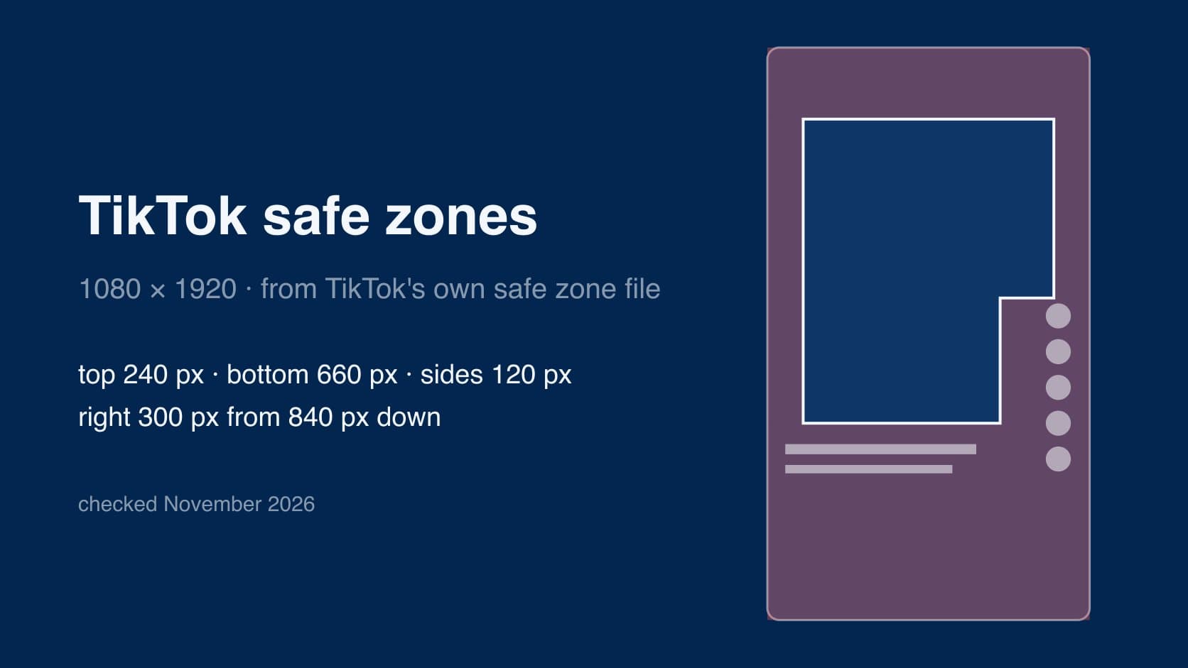
a TikTok safe zone is the part of a 9:16 frame that the app's own interface does not cover. everything outside it is real estate you are paying for and nobody can read: the tabs at the top, the column of buttons down the right, and the caption, username and sound line stacked along the bottom.
the trouble is that the safe zone is not one fixed rectangle. TikTok says so itself — its size depends on the shape of the video, how long the ad caption is, and whether anything else is attached to the ad. so the useful answer is a set of numbers, where they came from, and the one box that survives every version of them.
all figures below are on a 1080×1920 canvas, taken from TikTok's, Meta's and Google's own files, as checked on 2 November 2026.
every size, ratio, length and safe zone for Instagram, Facebook, TikTok and YouTube Shorts is on one page in the social media specs hub.
the short answer
for a standard TikTok In-Feed ad at 1080×1920, keep anything a person has to read out of these areas:
- top: 240 px (12.5%) — the Following / For You tabs and the status bar.
- bottom: 660 px (about 34%) — the caption, the account name, the sound line, the "Sponsored" label and the call-to-action button.
- left and right: 120 px each (about 11%) — device edges and rounded corners.
- the right-hand buttons: 300 px from the right edge, from 840 px down — profile picture, like, comment, share and the spinning sound disc.
that leaves an L-shaped area, wide at the top and narrower lower down where the buttons start. headlines, prices, logos, product shots and burned-in captions belong inside it.
where the numbers come from, and why other guides disagree
TikTok's In-Feed ad spec page (last updated June 2026) does not print pixel margins. it links downloadable safe zone files instead — one standard version, one for ads with an anchor, and Arabic right-to-left versions of each. the standard file is drawn on a 720×1280 frame with these margins: 160 top, 440 bottom, 80 each side, and a block 720 px tall down the right that stretches the right margin to 200 px. multiply by 1.5 and you get the 1080×1920 figures above.
that conversion is the source of most of the disagreement you will find online. several widely shared guides quote "160 px top, 440 px bottom, 80 px sides" as if those were 1080×1920 figures. they are the numbers printed on TikTok's 720×1280 file. applied to a full-resolution export they give you a top band two thirds of the size it should be, and text placed to that spec ends up under the caption. others quote 160 / 480 / 120. we could not find a TikTok source for that combination.
the people who have been caught by this describe exactly that gap between what the spec sheet said and what ran. from an agency thread about keeping creative compliant across networks:
"TikTok wanting safe zones respected so the UI doesn't cover your CTA, plus min resolution + duration requirements"
and TikTok's own page adds a caveat worth taking seriously: the preview in Ads Manager is not device-specific, so the live ad can sit slightly differently from what you approved. the margins are the protection against that, which is a reason not to shave them.
the caption moves the line
the bottom of the safe zone is not fixed. the ad caption grows upwards, so every extra line of copy pushes the caption block further into your frame. TikTok's anchor safe zone files show it directly, with four versions for one to four lines of caption. scaled to 1080×1920, with an anchor (a product or link card above the caption) attached:
| caption length | keep clear at the bottom | share of the frame |
|---|---|---|
| 1 line | 812 px | 42% |
| 2 lines | 878 px | 46% |
| 3 lines | 946 px | 49% |
| 4 lines | 1,014 px | 53% |
the anchor files also widen the right-hand margin to 240 px from 360 px down, and set the top at 252 px. so an ad carrying an anchor and a four-line caption leaves you roughly the top half of the frame, minus the edges. if you plan to attach a product card, design to these numbers, not the standard ones.
the practical rule: write the caption before you lock the edit, and if the caption is long, move the on-screen text up.
organic posts, ads and Spark Ads
organic posts. TikTok publishes safe zone files for ads only. there is no official organic safe zone. the organic interface has the same top tabs, the same right-hand buttons and the same caption-name-sound stack at the bottom, but no "Sponsored" label and no call-to-action button, so in practice the bottom band on an organic post is a little shorter. how much shorter depends on the caption, and any figure you see quoted for it is somebody's measurement, not TikTok's.
standard In-Feed ads. the ad caption is white text in a fixed font you cannot change, and it does not support clickable links, @ mentions or hashtags. the call-to-action button and the "Sponsored" label sit under it. this is the case the standard file covers.
Spark Ads. a Spark Ad runs an existing organic post as an ad, so the caption is pulled from the original post and TikTok displays up to four lines of it, emojis included. the post also picks up the ad furniture — the CTA and the label — that it did not have when it went out organically. that is the trap: a post laid out to organic margins, with text sitting just above a short caption, gets boosted and the CTA lands on the text.
so if there is any chance a post will be put behind spend later, lay it out to the ad safe zone from the start. it costs you nothing on the organic version.
one creative for TikTok, Reels and Shorts
all three run full-screen 9:16 video and all three cover roughly the same places, but none of them use the same numbers. on a 1080×1920 frame:
| keep clear | TikTok In-Feed ad | Instagram / Facebook Reels ad | YouTube Shorts ad |
|---|---|---|---|
| top | 240 px | 14% (269 px) | 288 px |
| bottom | 660 px | 35% (672 px) | 672 px |
| left | 120 px | 6% (65 px) | 48 px |
| right | 120 px, 300 px from 840 down | 6% (65 px) | 192 px |
| source | TikTok In-Feed safe zone file | Meta Ads Guide, Reels and Stories pages | Google Ads Help vertical video diagram |
take the strictest value on every side and you get one area that is clear on all three:
- from 288 px to 840 px down: 120 px to 888 px across.
- from 840 px to 1,248 px down: 120 px to 780 px across.
if you want a single rectangle to hand a designer or an editor, use x 120–780, y 288–1,248: 660×960 px, a bit over half the frame's height and 61% of its width. a headline, a price and a logo fit in it comfortably. that is the shaded area in the right-hand diagram above.
two caveats. first, every one of these is an ad safe zone; none of the three platforms publishes one for organic posts. second, the shared box assumes a standard TikTok ad. add an anchor or a long caption on TikTok and its bottom band grows past everyone else's, so check the table in the caption section.
the Meta numbers changed shape recently enough that older sources disagree with them. Meta's Stories pages now give the same 14% / 35% / 6% as Reels. many third-party guides still give Stories a smaller bottom band of around 20%. we have gone with Meta's own pages. the full Meta placement table is in the Meta ad specs guide.
the mistakes that keep happening
text and logos under the buttons
the right-hand rail is the one people forget, because it is narrow and it does not start at the top. a logo tucked into the lower-right corner — the exact spot most brand guidelines put it — is underneath the share button and the sound disc. right-aligned headlines get their last word clipped the same way. centre or left-align, and keep the right 300 px clear from 840 px down.
captions under the description
the second most common one, and the reason is habit: on YouTube and on TV, subtitles live at the bottom of the frame. on TikTok the bottom third is where the app's own caption is. burned-in captions placed in the traditional subtitle position sit directly behind the ad text, and the two become unreadable together. one practitioner's workflow gets this right:
"Captions. Most people watch on mute, so captions are part of the ad, not an extra. Keep them in the safe zone, middle third, away from the edges."
"middle third" is a good habit for one creative across platforms, though it is stricter than any platform requires. TikTok's standard zone lets text sit as low as 1,260 px, which is well into the lower third.
designing for a one-line caption, then writing four
the edit is approved with a placeholder caption, the copywriter adds three more lines in Ads Manager, and the bottom band grows by about 200 px. see the caption table above: a long caption costs you up to half the frame.
using the 720 numbers on a 1080 export
covered above, and it is worth repeating because it is so common: 160 / 440 / 80 are TikTok's numbers for a 720×1280 frame. at 1080×1920 they are 240 / 660 / 120.
shipping the wrong shape
TikTok accepts 1:1 and 16:9 for non-Spark ads, but they play with bars, and nothing about the safe zone helps a video that only fills half the screen. this happens far more than it should, usually when one master creative gets exported many times:
"Then the same master creative needs 6 different aspect ratios and someone always ships a 1:1 where a 9:16 should go"
in a brief-based contest it is simply fatal. from a writeup of why entries were thrown out of one:
"Wrong aspect ratio — brief asked 9:16, some submitted 16:9. Good videos, instant disqualification."
checking by eye
the last one is process, not layout. the same agency thread:
"Right now our process is basically: designer exports everything, someone eyeballs it against a checklist in Notion, we upload, half get rejected, we redo, repeat. Feels very 2015."
the cheap fix is to put the platform's own overlay on top of the edit before export. TikTok's safe zone files are PNGs built for exactly that. drop the one that matches your caption length onto a top layer in your editor and look.
the specs alongside the safe zone
from TikTok's In-Feed ad spec page, last updated June 2026, for non-Spark ads:
- ratio: 9:16 recommended. 16:9 and 1:1 are accepted.
- resolution: at least 540×960 for vertical. TikTok's page states only the minimum; 1080×1920 is the usual export and what the numbers in this guide are drawn on.
- file types: .mp4, .mov, .mpeg, .3gp or .avi.
- length: up to 10 minutes.
- file size: 500 MB or less, bitrate at least 516 kbps.
- account name: one line, up to 20 characters (10 in Chinese, Japanese or Korean).
- profile picture: 98×98, with the important part inside the central 66×66 so it is not cropped.
Spark Ads take .mp4 or .mov with no length limit, because they are whatever the original post was.
the summary
- at 1080×1920, TikTok's standard safe zone is 240 top, 660 bottom, 120 each side, and 300 on the right from 840 down. those come from TikTok's own file, scaled from 720×1280.
- 160 / 440 / 80 is the same zone measured on a 720 frame. it is the most common wrong number online.
- the caption moves the line. with an anchor and four lines of caption, the bottom 53% of the frame is covered.
- there is no official organic safe zone. design organic posts to the ad zone anyway, because a Spark Ad adds the CTA on top of them.
- x 120–780, y 288–1,248 is clear on TikTok, Reels and Shorts ads at once. put the words, the price and the logo there.
- overlay the platform file before export. it is quicker than a rejection.
if you are making the creative in Clear Cortex, the video studio makes 9:16 and 1:1 and the image studio adds 4:5, so the vertical master and the feed version can come from the same project. the safe zone is still yours to respect.