 Clear Cortex
Anyone making a poster, an ad or packaging
Posters, and anything else with words on it
Most image models cannot spell. GPT Image 2 can, which makes it the one to reach for when the image has to carry a headline — and it changes how you write the prompt, how you fix a wrong word, and how you get a cut-out.
15 minutes · 7 steps
Choose GPT Image 2 first, before anything else
This is the whole decision. Type is where image models fall down, and it is the one thing this model is reliably better at. It is also the cheapest premium option on the list, from 7,000 credits — so getting the words right is not the expensive choice here.
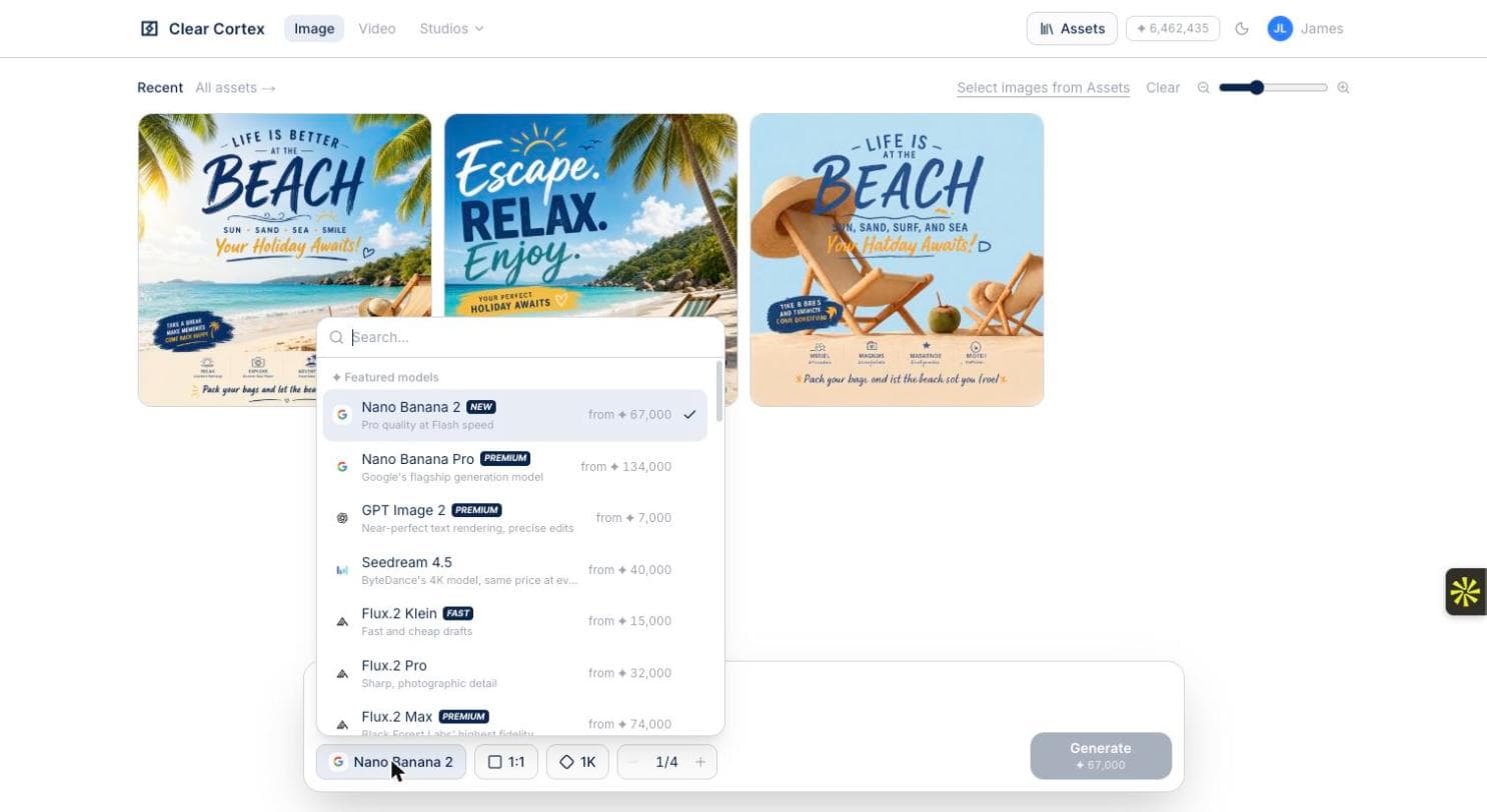
Put the exact words in the prompt, in quotes
Write the copy as you want it set, line by line, rather than describing it: a headline reading "LIFE IS BETTER AT THE BEACH", a strapline reading "SUN, SAND, SEA". Left to invent its own wording, the model will, and you will be editing text you never asked for.
Set quality, and know what Background does
Quality is this model's price dial — low, medium, high — so a batch of drafts is cheap and the final pass is not. Background offers Auto or Opaque only: Auto lets the model decide, Opaque forces a solid one. There is no transparent setting here; that comes later, as an edit.

Ask for several and choose
GPT Image 2 makes up to ten images per call, so a set of four arrives in one round trip rather than four. When you generate without references it streams a preview as it draws instead, one at a time — which is worth having, because you can kill a bad composition before you have paid for it.
Fix the wording with Edit text, not a regeneration
Open the poster and use Edit text: it reads the current lines out for you and you replace only the ones you want changed, leaving typeface, colour, placement and everything else alone. Regenerating instead gives you a different poster, which is rarely what you wanted when the only problem was one word.
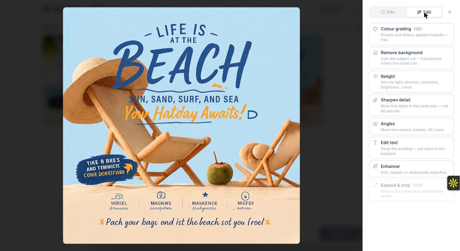
Do not run a finished poster through a model that cannot spell
This is the same beach poster after an edit on a model chosen for looks rather than type. The layout survived; the words did not — the strapline now reads "Your Hatday Awaits!" and the footer is nonsense. Once a headline is right, keep every later edit on a model that holds type, or use the edit tools, which pick an appropriate model for you.
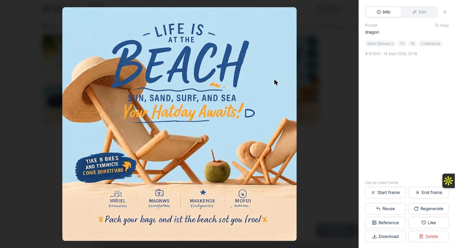
Cut it out when it has to sit on something else
Remove background in the Edit panel is the route to a transparent version — it cuts the subject out and hands back a PNG you can place. That is an edit step, not a setting on the prompt bar, which is why the Background control has no transparent option.
What you end up with
A poster whose headline reads correctly, with the wording still editable afterwards rather than baked in — and a cut-out version if you need to place it on something else.